- HOME
- About Toray
- Corporate Profile
- Corporate Symbol
Corporate Symbol

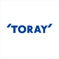
The corporate logo used for Toray Industries, Inc., was first designed in 1986 to celebrate the 60th anniversary of our founding. This symbol represents Toray as a corporation, the Toray employees, the Toray facilities and assets, Toray products, and the Toray message. The characteristic single quotation marks symbolize Toray's enthusiastic attitude toward dialogue. We strongly value communication among Toray employees and with those outside the company, and we desire to be a leading presence in society. The logo has symbolized Toray for more than 30 years, since it was first adopted to the present day. Called Toray blue, the symbol is a deep, chic shade of blue that signifies an intellectual refinement and precision, as well as a refined sense of fashion. This shade is also referred to as “intelligent blue.”
Corporate Slogan

The Thinking Behind Our Corporate Slogan
In April 2006 we created a new, long-term corporate vision—"AP-Innovation TORAY 21"—and adopted the corporate slogan "Innovation by Chemistry," declaring our aspiration "to become a top global corporation in advanced materials."
The word "Chemistry" has two meanings. The obvious one is the science that forms the basis for the advanced materials which we supply. The other is rapport. For us, that means maintaining a good rapport with everyone who is involved with TORAY—customers, employees, shareholders, business partners, consumers, and people in the local community—and maintaining good rapport among the companies in the TORAY group and strong connections among our business offices throughout the world.
"Innovation" is how we will realize our corporate philosophy of "Contributing to society through the creation of new value." "Innovation" refers not only to technological innovation but to our intention to pursue innovation in all aspects of our corporate activities.
"Innovation by Chemistry"
This corporate slogan declares our intention to generate positive reactions and create good rapport in all areas of our corporate activities with a focus on advanced materials, along with the specific aim to pursue innovation as part of TORAY's continuing evolution and development.
Transformation of the Corporate Symbol
The Toray corporate symbol has been altered three times. Its evolution is outlined below.
1926-1963
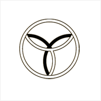
No victory without unity
Toyo Rayon Co., Ltd. was founded in 1926 as a producer of viscose rayon. The design of the corporate logo used at the time ? three interlocking rings placed inside a double circle, symbolized the opportunities given by heaven, the advantages of the land, and the harmony between human beings. It also represented the formation of the four letters of TOYO. Faced with the Great Depression and downturns in the fiber and textile market soon after its founding, as well as post-WWII confusion, Toyo Rayon overcame many hardships. However, as the Japanese economy recovered and developed a period of strong growth in fifties and sixties, Toray expanded into a comprehensive manufacturer of synthetic fibers.
1963-1969
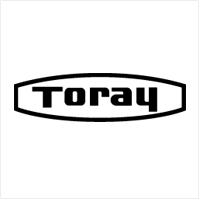
Bobbin style logo
After World War II, abbreviated versions of the name Toyo Rayon Co., Ltd., had become common. After considering Tore and Toray as possible English spellings, Toray was eventually chosen as the official abbreviation . The corporate logo was redesigned, and both internal and external stakeholders in the company favored a logo designed as a bobbin.
1970-1986
Global Toray
Having restructed of Toyo Rayon Co., Ltd. on January 1, 1970, the company was officially renamed Toray Industries, Inc. The company's operations had, however, outgrown the name Toyo Rayon long before. At the time, Toray was evolving from a general manufacturer of synthetic fibers into a comprehensive chemical company operating in a wide array of chemistry-oriented sectors, including plastics, fine chemicals, and pharmaceuticals. To further internationalize our business operations, it was important to move beyond "Toray of the Orient" into a global Toray, and we took on a new corporate name and symbol to make these intentions clear.
1986-
Communicating with society at large to ensure mutual growth
In 1986, Toray marked the 60th anniversary of its founding. Sixty years of production is a significant benchmark, and we used this occasion to introduce a company-wide "New Foundation Campaign" to guide Toray renewal. Following the Plaza Accord signed in September 1985, the exchange rate for the Japanese yen soared, and this was a period of major change not only for the fiber and textiles industry, but also for the structure of Japanese industry as a whole. Toray focused on restructuring its business operations and strengthening its corporate structure, as well as on expanding globally as a corporate group, by enhancing operations in the overseas production sites that had been pursued since the 1960s. The "New Foundation Campaign" was primarily centered on reforming employee awareness, and a new corporate symbol was adopted as part of our new Corporate Identity (CI). The design, created by Colin Forbes, the founder of the US design company Pentagram, was chosen for its originality and the "intelligent blue" color. The quotation marks are used as they are in English sentences to indicate dialogue and prominence. The symbol was designed to express the Toray Group commitment to always communicate with society at large and ensure mutual growth. It also expresses the group's ambition to be a prominent presence in the 21st century.
To mark the 80th anniversary of its founding in 2006, Toray chose "Innovation by Chemistry" as the new corporate slogan to accompany the corporate symbol.